Great!
you may be saying now. Now that Ive created a cube I can jump
straight in to the deep end and start on my first masterpiece!
Wrong, I say. What happens when you go to create a roof on your
house that requires a different shape other than that of a simple
cube? The answer is within this section of the chapter. Hopefully
it will teach you how to make some more basic shapes for your
creations.
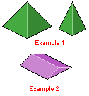
First up is the pyramid. You can have normal pyramids or long
sections of block with triangle ends. First up we will look at
the normal pyramid. Below is an example of how a normal pyramid
should look in the isometric style. The sides are straight up
and down at a 45° angle. We can change this angle to make the
pyramid smaller, as you can see in the second example. If you
look closely you should be able to recreate something similar
using the same techniques you used to create the cube.
 Figure
2.9
Figure
2.9 |
Now that you have hopefully got the pyramids out of the way (you
can refer back to this section if you need to at any time), we
can make some more cool shapes. Now lets make a cylinder, which
are very easy to make. All a cylinder is really made up of are
two circles joined by a middle section. Below is an example of
a cylinder. To create a circle in the isometric view we first
have to make an isometric square, making sure that our circle
fits within those boundaries. I have included this process below
as well. The shading as you can see, is simply a gradient of colours,
going from dark to light. This shading technique gives the illusion
of depth as the 2D object is transformed using shadows and highlights.
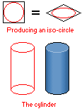
Figure 3.0 |
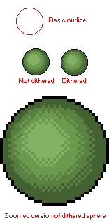
On the subject of round things, one of the most difficult shapes
to create in the isometric viewpoint is the sphere. Spheres are
basically flat 2D circles; coloured and shaded in such a way as
to make them appear 3D. The shading is much like the way I shaded
my cylinder. Starting from dark and gradually bringing the lightness
of the colour up, giving an illusion of depth. As you can see
in the example image below, I have provided the basic outline
and then the complete piece. Also there is a zoomed in image of
the same complete piece. You can see that Ive used dithering
the make the gradient appear less ugly, making it blend in more.
Dithering is the process of taking a colour next to another colour
and placing a checker type pattern, or sometimes a random pattern
of dots within the other different colour. When zoomed out fully
the dots and the different colour blend quite well, creating a
colour that is somewhere in the middle of the two, thus mixing
them and making the join look smooth.
 Figure
3.1
Figure
3.1 |
|